-
Welcome to Photrio!Registration is completely free and logged-in members see fewer ads.Click here to sign up
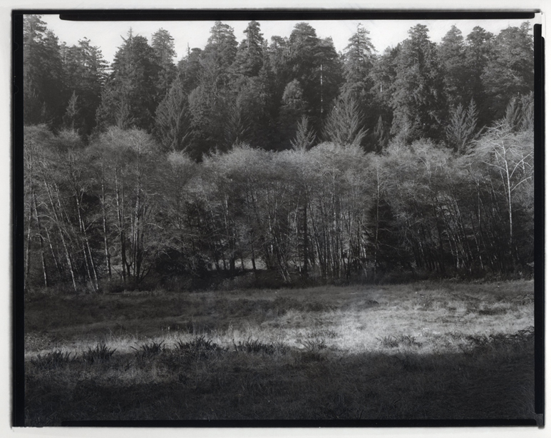


Grass, Alders,Redwoods
-
A
- Vaughn
- Location
- Prairie Creek Redwoods State Park
- Equipment Used
- deardorf 8x10, 210mm Schnieder Anglon
- Exposure
- F64 at 15 seconds
- Film & Developer
- Kodak Copy Film at 50 ASA, HC-110, 1:20 70F 7 min, constant agitation in a tray
- Paper & Developer
- homemade carbon
| Photrio.com contains affiliate links to products. We may receive a commission for purchases made through these links. To read our full affiliate disclosure statement please click Here. |
PHOTRIO PARTNERS EQUALLY FUNDING OUR COMMUNITY:  |