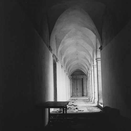
The tonality of this print is - to my opinion - very nice. It's good a great "moody" feel to it. The composition is quite masculin (read: "horizontally aligned with sharp perspective lines"). I guess what I "miss" would be a "centre of attention"... but then again I am a portrait kind of person, so what do I know.
I like the tonality, but i would have printed it at .5 to 1 grade higher. Composition wise i would have used a portrait format and left out most of the left black zone.
Very nice picture. I agree with Marc: crop a bit of the left side. The centre of interest is there: the table and the litter on the floor. It could be the scan or my monitor but the light part of the left wall would benefit from a bit of burning-in.
Now I need to reply again ;-). Cropping off the left side really changes the picture; the strong lines will disappear then, resulting in a - to me - "more flat" composition. Also burning in the highlight will probably make the picture more dull... but then again, I guess I am not a "true b/w person" as I don't care too much about burnt parts as long as they add to instead of distract from the concept.
Thank you for the comments.
Crop on the left or not? Because I'm a beginner with my 6*6 camera, I wanted to use the full frame. The square format is for me a challenge to find a good composition.
The use of .5 or 1 higher grade? The scan is softer then the original print.
i too agree with the contrast grade of +1. Besides that i would have placed the door in the horizontal middle so that the left and right black area would have the same dimension.
Photrio.com contains affiliate links to products. We may receive a commission for purchases made through these links. To read our full affiliate disclosure statement please click Here.
PHOTRIO PARTNERS EQUALLY FUNDING OUR COMMUNITY:
This site uses cookies to help personalise content, tailor your experience and to keep you logged in if you register.
By continuing to use this site, you are consenting to our use of cookies.