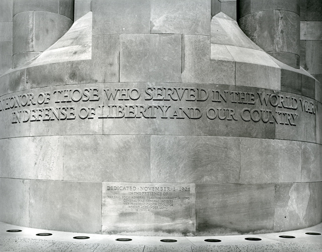
Look at those highlights and how crisp they are! I mean, of course the other image was printed abit darker, but this one still has all the information and a beautiful glow.
Look at those letters, and how they seem 3-D like in the photograph.
Very nice Alex. A good use of a few of your sheets of precious AZO.
Any way you could balance out the light in this image by a SLIGHT dodge of the right?
Thanks Ryan. On the print, there is hardly a noticeable difference between the left and right sides. My scanner seems to greatly enhance those very small differences for some reason. Maybe its something to do with the contrast settings. I have no clue.
Excellent, I much prefer the tonalities in this version as well as the tiny crop off the right side. I have to agree with Ryan about the slight dodge on the right side to even things up a bit. Nice work, Alex. Best. Shawn
Edit: I must have been writing my post when you made your comment, Alex. I know what you mean, I've spent my share of time adjusting scans that look competely different than the print from which they came...
Agree about the additional burn, I think it might add just a bit of depth to the image, without making it look too heavy. Tonality on this one is very nice. The actual print must be stunning. Good one Alex. tim
Photrio.com contains affiliate links to products. We may receive a commission for purchases made through these links. To read our full affiliate disclosure statement please click Here.
PHOTRIO PARTNERS EQUALLY FUNDING OUR COMMUNITY:
This site uses cookies to help personalise content, tailor your experience and to keep you logged in if you register.
By continuing to use this site, you are consenting to our use of cookies.