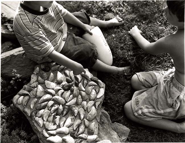


Lobster Buoy and the Sea Shells II
-
A
- SuzanneR
- Location
- Rockport, ME
- Equipment Used
- Mamiya 7/80mm
- Exposure
- F 5.6
- Film & Developer
- TXP in x-tol
- Paper & Developer
- Ilford MGIV/Ethol LPD, then toned in Kodak Sepia Toner
| Photrio.com contains affiliate links to products. We may receive a commission for purchases made through these links. To read our full affiliate disclosure statement please click Here. |
PHOTRIO PARTNERS EQUALLY FUNDING OUR COMMUNITY:  |