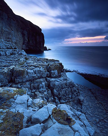
The cyan/blue cast in this image is really bothersome to me. I realize your intentions with trying to put more emphasis on the little orange spot, however...I think it could have abit more red and yellow in it to take away the blue cast.
Not everywhere and everything is rosey all the time Ryan.
I always work with the natural scene, light and conditions rather than try to impose my ideals on them. This is why I enjoy the challenge of photography so much and perhaps why my pictures are so varied, be they colour or B+W.
I did look at using a warm-up filter, but chose not to. If I was uncertain about elements of this picture, then this would have been posted in the critique gallery as I usually do when seeking counsel of fellow APUG members.
Personaly I like the blue cast the image has. It makes it looks colder(not color temparature I mean weather) and ads to the overall mood which I think this image has tons of. Nice one!
I think what Ryan may mean is that the blue cast, mainly on the rocks, probably wasn't actually there, but is a classic syndrome of using velvia in shadow and dark areas. The warming filter may have simply put the colors back to natural. But, it's your creation, so more power to you.
Thanks for commenting everyone. I really didn't expect so many!
Intentionally not correcting the colour cast is quite a common practise, especially as here to emphasise the colour contrast with the small patch of distant warmth in the dawn sky.
The natural blue cast under these lighting conditions is common, and I actually feel it works well in this image. However, I just think it's abit too much when it starts to look artifical.
Instead of the blue cast just being in the shadows, it's pretty much the whole image. Just for fun, I put your image into photoshop and added a slight bit of red/yellow and I was suprised to find the beautiful orange in this image (which is probably what you orginally responded to in this scene) is being reflected in the ocean, and even a little bit on the rocks in the bottom right corner! This is absolutly beautiful! You can actually emphasis the color in the sky more by fixing it!
With the image completely blue, your eye moves directly to the orange spot in the sky and is less likely to explore the rest of the image. With a slight color correction, it brings more visual interest into the rest of the photograph, and my eye moves from the yellow growth on the rocks in the forground, to the beautiful colors reflected in the ocean and sky, and wraps back around the cliff.
Yes it all seems so long ago now! Am trying to work out how I can come up with something original from here next winter.
It does work well in B+W, so you might want to give it a visit. I'm sure you could wreak wonders there. Allow 20 mins transit from car park though - and take a torch....
Photrio.com contains affiliate links to products. We may receive a commission for purchases made through these links. To read our full affiliate disclosure statement please click Here.
PHOTRIO PARTNERS EQUALLY FUNDING OUR COMMUNITY:
This site uses cookies to help personalise content, tailor your experience and to keep you logged in if you register.
By continuing to use this site, you are consenting to our use of cookies.