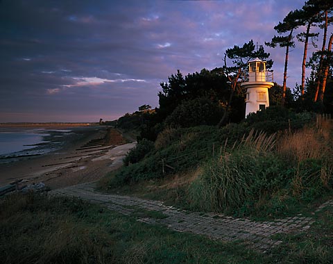


Millenium Beacon - Sept 06
- Location
- Lepe, Solent UK
- Equipment Used
- Ebony SU45 90mm lens
- Film & Developer
- Velvia 50 pushed 1/3 stop
- Paper & Developer
- Transparency scan
- Lens Filter
- ND Grads
| Photrio.com contains affiliate links to products. We may receive a commission for purchases made through these links. To read our full affiliate disclosure statement please click Here. |
PHOTRIO PARTNERS EQUALLY FUNDING OUR COMMUNITY:  |