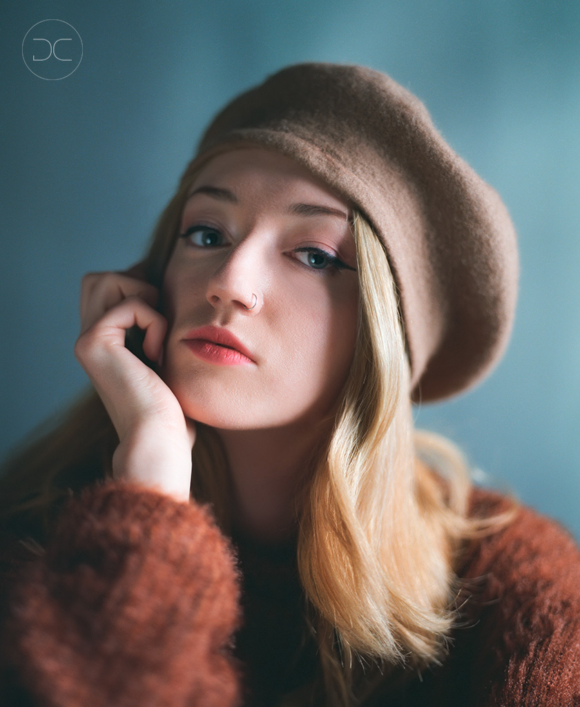


RZ67 Fashion Portrait Attempt No 3
- Location
- UK
- Equipment Used
- Mamiya RZ67 Pro 2, 110mm f2.8
- Exposure
- f2.8, 1/15th sec
- Film & Developer
- Portra 400
- Hybrid Materials & Processing
- Nikon Ls9000 Scanner with Vuescan, ColorPerfect
- Digital Post Processing Details
- Light work in Photoshop, blemishes and skin.
- I grant PHOTRIO permission to share this gallery image and previous images on their social media pages.
-
- Yes
- (optional) Preferred name for image credit on social media.
- David Clapp Photography Ltdc
| Photrio.com contains affiliate links to products. We may receive a commission for purchases made through these links. To read our full affiliate disclosure statement please click Here. |
PHOTRIO PARTNERS EQUALLY FUNDING OUR COMMUNITY:  |