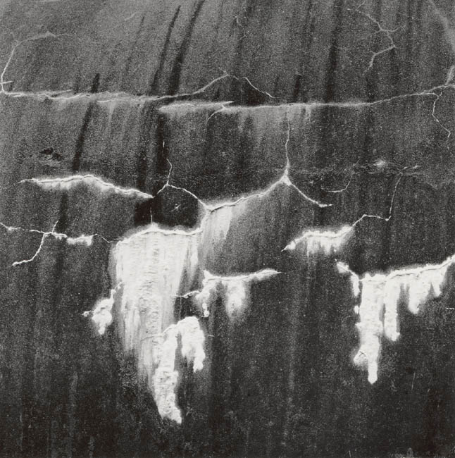
This is neat. Nice job printing, too! I might be tempted to crop the top down to just above that heavy, horizontal line to focus the viewer to the cool patterns.
I really like the image, and I think this has real potential to become great. Personally I would print it about 1 1/2 stops darker and increase the contrast by a few grades as well. I would then crop the top 1/3 off to strengthen the design. I have seen very similar work by Minor White
If you would like I will post my 'vision' on the web for a few days so that you can see how I would print it.
Thanks Phill, I look forward to that. The actual print is more contrasty and darker. This is one of those images that I keep revisiting, great to get some feedback on it.
Photrio.com contains affiliate links to products. We may receive a commission for purchases made through these links. To read our full affiliate disclosure statement please click Here.
PHOTRIO PARTNERS EQUALLY FUNDING OUR COMMUNITY:
This site uses cookies to help personalise content, tailor your experience and to keep you logged in if you register.
By continuing to use this site, you are consenting to our use of cookies.