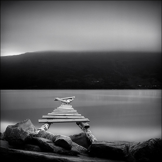


3751brygge01-duotone-550
-
A
- eholmoyv
- Location
- Nordfjord district, Norway
- Equipment Used
- YashicaMat 124G
- Exposure
- Appx. 4 minutes
- Film & Developer
- Fuji Acros 100 developed in Agfa Rodinal at 1:50 for 11,5 minutes
- Lens Filter
- B+W ND 4.0
| Photrio.com contains affiliate links to products. We may receive a commission for purchases made through these links. To read our full affiliate disclosure statement please click Here. |
PHOTRIO PARTNERS EQUALLY FUNDING OUR COMMUNITY:  |