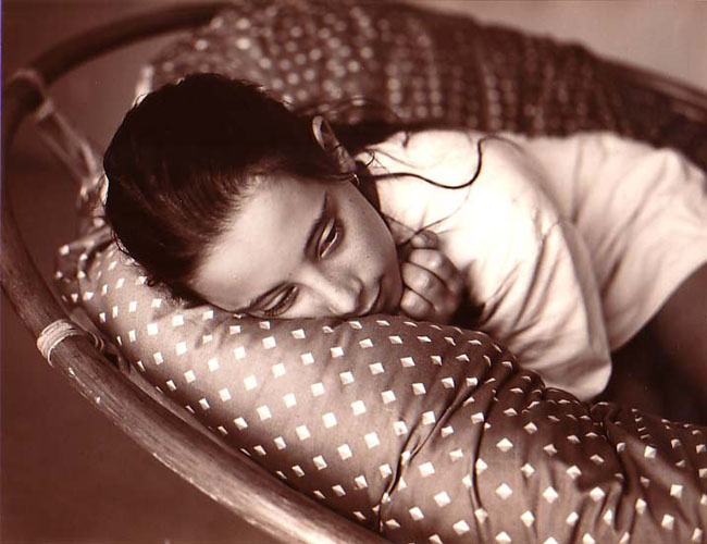


Jessica
- Location
- At home, Bega, S.E. Australia
- Equipment Used
- Voigtlander Superb, 75mm f3.5 Skopar
- Exposure
- 15th @ f4.5
- Film & Developer
- HP5+, D23 1:1
- Paper & Developer
- Forte warmtone, selenium toned
- Lens Filter
- none
| Photrio.com contains affiliate links to products. We may receive a commission for purchases made through these links. To read our full affiliate disclosure statement please click Here. |
PHOTRIO PARTNERS EQUALLY FUNDING OUR COMMUNITY:  |