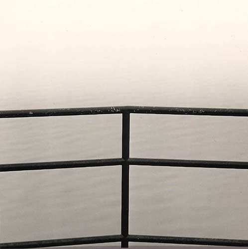
I like the simplicity of the composition and feeling of the image. One small criticism would be that the image as shown is not perfectly symetrical. I think for this composition to really work, the symetry would have to be "right on". This can be easily corrected when printing. I do like the image, thanks for sharing.
I like this image very much also. I find myself wondering why/how it is that I am so attracted to so little - only in the sense of little content, not artistic value, of which it has plenty. I would not change a thing and I do not understand why anyone would feel the need to make the image symmetric. Or, more to the point, if a viewer found himself feeling a need for symmetry (or anything else for that matter) then perhaps it would be more constructive to explore how the image makes you feel that need, rather than move to remove the feeling.
Thanks to all for looking and the thoughtful comments. I wanted to explore how far I could go with the "distillation" of elements with this photograph, acknowledging the risk of it becoming completely insipid. I hoped that the viewer would be drawn in by the graphic element and then explore the more subtle tones and texture. Perfect symmetry wasn't at the top of my mind, but may have a subconscious influence the viewer.
Daniel,
Another great shot. Symmetry is helpful - I'm not sure this would have worked unless it was either symmetrical or very asymmetrical. Thanks for sharing.
JOhn
Photrio.com contains affiliate links to products. We may receive a commission for purchases made through these links. To read our full affiliate disclosure statement please click Here.
PHOTRIO PARTNERS EQUALLY FUNDING OUR COMMUNITY:
This site uses cookies to help personalise content, tailor your experience and to keep you logged in if you register.
By continuing to use this site, you are consenting to our use of cookies.