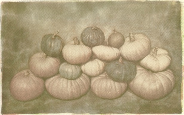
I'll be the contrarian. I like this one better. For me, the faded look works well for the image and pops the pumpkins out a bit more compared to the background. But both are really nice!
Thanks Bethe. I made this one first, liked it, but thought I wanted to see it with more colour. Now that I've got both, I'm torn. I think I might end up with this as my choice.
Photrio.com contains affiliate links to products. We may receive a commission for purchases made through these links. To read our full affiliate disclosure statement please click Here.
PHOTRIO PARTNERS EQUALLY FUNDING OUR COMMUNITY:
This site uses cookies to help personalise content, tailor your experience and to keep you logged in if you register.
By continuing to use this site, you are consenting to our use of cookies.