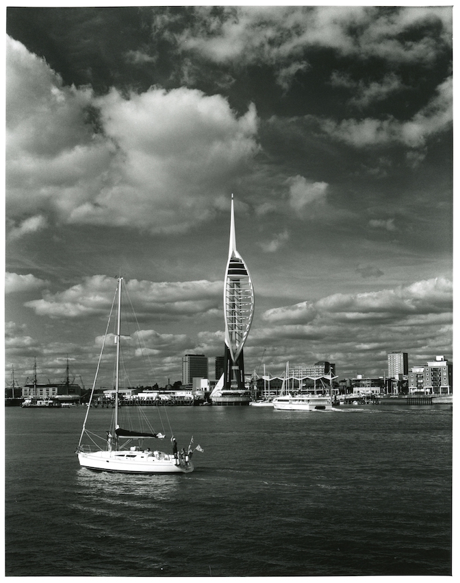
The same picture on Ilford multigrade at grade 4. The highlight boat and tower are still white but at a harder grade the clouds become more prominent and the mood changes.
The detail is there on the actual print. I did consider it but I don't think it would add anything. Converting the print to a minuscule jpg as small as the days of modems on a wet piece of string doesn't really do it any favours. I still can't decide between a or b.
The yacht is quite close to the camera and moving. Limitations of shutter speed and depth of field probably mean the yacht isn't perfect anyway. The distant tower is in perfect focus even if the tiny jpg looks otherwise.
Nice print! I love how the clouds are more interesting and play a larger role, and how the water looks darker making it far easier to attend to the points of interest.
Thanks, I actually think it is too dark and prefer "a' which is has a nice sparkle. This may look more dramatic but it is skewed from reality and hence I don't like it! I dislike "arty" photographs really. The "3-D effect" clouds I do like......I could tell immediately this was going to be fun when I looked at the negative.
Photrio.com contains affiliate links to products. We may receive a commission for purchases made through these links. To read our full affiliate disclosure statement please click Here.
PHOTRIO PARTNERS EQUALLY FUNDING OUR COMMUNITY:
This site uses cookies to help personalise content, tailor your experience and to keep you logged in if you register.
By continuing to use this site, you are consenting to our use of cookies.