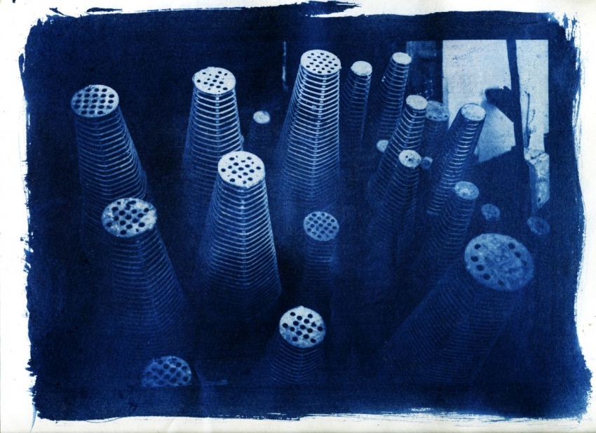
Nice graphical composition - the cones are almost abstract. And the cyanotype blue works well here too. If anything, your highlights could stand to come up just a hair, to give it a little more pop. But that's a minor quibble.
Thanks! For the digital negative, I was using a kind of clear decal, meant for making store signage, which has a light adhesive backing. Unfortunately, ink doesn't seem to stick to it enough to allow the buildup of much highlight density, which is why the midtones and highlights seem to be lacking. I have some better inkjet-printable acetate arriving soon. Hopefully it'll yield more suitable results. Compare the original shot: https://flic.kr/p/CsVgbe
Photrio.com contains affiliate links to products. We may receive a commission for purchases made through these links. To read our full affiliate disclosure statement please click Here.
PHOTRIO PARTNERS EQUALLY FUNDING OUR COMMUNITY:
This site uses cookies to help personalise content, tailor your experience and to keep you logged in if you register.
By continuing to use this site, you are consenting to our use of cookies.