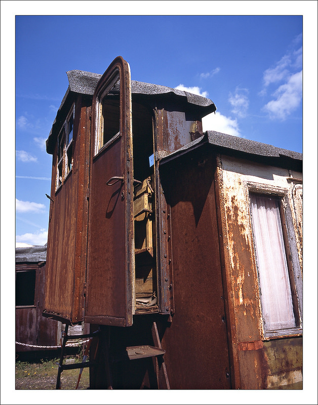
Usually, I prefer those muted colors or pastel tones ...
The cold and dark season is finally over and I was in the mood for some catchy colors -
this series was taken with FUJI Provia 100F
Given what so many say, imagine how really harsh this would have been on Velvia 50! All these compositions in this series are just great. Well, as HiHo points out the blue sky here is tremendously nice.
Even Ektar gets a bit much sometimes. Sometimes a good poke in the eye is what the doctor ordered, but I love the color rendering here. I'm not expert or even smart about it, but it looks very real, not flickr-ish. 'Very glad to see Fred.
Photrio.com contains affiliate links to products. We may receive a commission for purchases made through these links. To read our full affiliate disclosure statement please click Here.
PHOTRIO PARTNERS EQUALLY FUNDING OUR COMMUNITY:
This site uses cookies to help personalise content, tailor your experience and to keep you logged in if you register.
By continuing to use this site, you are consenting to our use of cookies.