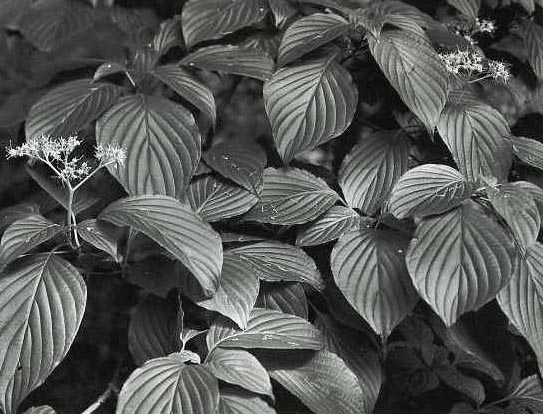
If I hadn't seen leaves in B&W, I'd have said that they were one of the few things that call for colour. Yet taken properly, like these, they have a luminescence that I don't think colour would convey. I am still puzzled as to why they are conveyed so well in B&W. Maybe others can help here with a "eureka" explanation.
Very nice shot of the leaves, textures and highlights. To take a stab at the answer to pu's question, this shot is a good example of a proper exposure, tonality and development. If they were flat, it wouldn't be as nice. They do have a nice glow to them, don't they? tim
This is excellent. It also represents what happens when shooting the picture in the "correct lighting environment". The lighting provided the opportunity to express a full range of tones on a fairly monochrome image. For my money, most color shots would have been "postcardish". This is a well executed image...
I would be interested to know what grade the shot was printed on? Was the negative kind of flat, and corrected with a stronger grade paper when printing?
Thanks very much, to all, for your comments. I do all my printing in a split grade, so it is hard to answer JeffD's query directly, except to say that you are basically right. This shot did require more "high contrast" exposure to get the desired results.
It's been my experience that it is easier to get this tone structure with leaves that have a little sheen to them. Leaves with a dull surface don't work as well.
Photrio.com contains affiliate links to products. We may receive a commission for purchases made through these links. To read our full affiliate disclosure statement please click Here.
PHOTRIO PARTNERS EQUALLY FUNDING OUR COMMUNITY:
This site uses cookies to help personalise content, tailor your experience and to keep you logged in if you register.
By continuing to use this site, you are consenting to our use of cookies.