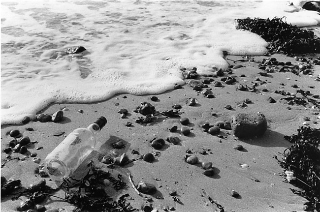
Interesting composition. Did you place the bottle there, or point it in a certain dirrection? It certainly works being in that part of the image. I might suggest a corner burn on the top left corner. It needs to be just abit darker to hold the viewers eye from leaving that corner, and also to balance out the weight of the other dark form in the top right corner.
Thanks for your comments Ryan. The bottle is as I came across it, I have about fifteen negs of it being rolled by the surf and deposited in various positions. Right after I took this shot I got wet feet as the tide was incoming...
The print was not easy to make, I had to burn the foam quite a bit (an additional 20 seconds) to bring out the darker patches of water. I may try again giving some more burn in that top left corner. Here is a neg scan of a frame made fifteen seconds earlier.
How did you decide on yellow 5? On a Durst M605 colour head this is would be so small as to hardly make any difference. I appreciate Meopta may well be different. I appreciate your photographic integrity in shooting exactly as found. I'd have been tempted to turn the bottle round to reveal what it had contained. Foam looks pretty good to me. It's always very light in colour and can almost hurt the eyes and so it should in the print.
The Yellow 5 happened because at all zero the contrast was far too strong (Multigrade 2) and shadow detail was lost, so I went to the next contrast step down, which on the meopta is 30 Y, but that washed the print right out and blew the highlights especially on the bottle. I ended up fine tuning and finished at 5 Y.
Photrio.com contains affiliate links to products. We may receive a commission for purchases made through these links. To read our full affiliate disclosure statement please click Here.
PHOTRIO PARTNERS EQUALLY FUNDING OUR COMMUNITY:
This site uses cookies to help personalise content, tailor your experience and to keep you logged in if you register.
By continuing to use this site, you are consenting to our use of cookies.