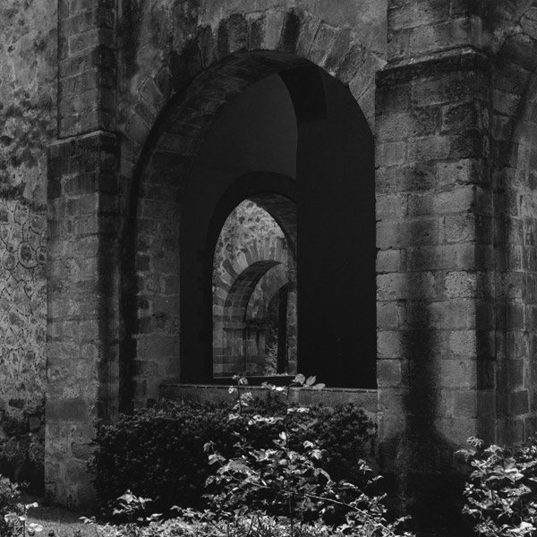
Juanito, the composition is interesting but IMO is too busy, you are trying to show too much and too many arches. It also needs a little bit more contrast for my taste.
The image on my monitor appears to be printed down a bit too much, almost muddy.
However the high lights on the leaves in front won't stand for much contrast increase.
I like every thing about the composition, especially see'ing into the arches. My opinion is that with a bit of tweeking, dodging and perhaps a small amount of burning this negative could make a more exciting and beautiful final print.
Photrio.com contains affiliate links to products. We may receive a commission for purchases made through these links. To read our full affiliate disclosure statement please click Here.
PHOTRIO PARTNERS EQUALLY FUNDING OUR COMMUNITY:
This site uses cookies to help personalise content, tailor your experience and to keep you logged in if you register.
By continuing to use this site, you are consenting to our use of cookies.