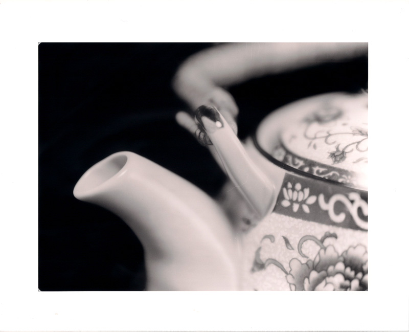
On my screen this print has a lovely delicate pinkish look which really suits the subject. Unfortunately I have to assume that this pink look is either your scanner and/or my screen as there is no mention of anything to create this look in the information sectionIt might however be worth exploring how to get this tone. Moersch Easylith perhaps?
Pinkish? Sounds lovely. It may well be that my monitor/scanner are misaligned. I do find that this paper, which was a very old unopened package given to me by a friend, yields a very slightly warm tone in the light and mid-range under standard processing. Thanks for looking.
So delicate and fragile. It's beautiful, Tom. I see pink too, it works very well with the porcelain. But my monitor could be a bit off. Merry Christmas!
i didn't see pink initially, but after reading the above posts and looking again, well...what a wonderful image! i find that the patteron on the pot lends itself to its positioning and degree of bokeh. bravo!
Photrio.com contains affiliate links to products. We may receive a commission for purchases made through these links. To read our full affiliate disclosure statement please click Here.
PHOTRIO PARTNERS EQUALLY FUNDING OUR COMMUNITY:
This site uses cookies to help personalise content, tailor your experience and to keep you logged in if you register.
By continuing to use this site, you are consenting to our use of cookies.