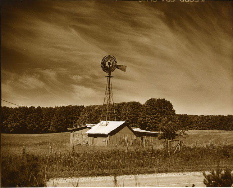


U.P. Windmill Sepia
-
A
- bsdunek
- Location
- Just East of Curtis
- Equipment Used
- Mamiya Super 23, 100mm f3.5 lens
- Exposure
- Metered
- Film & Developer
- Ilford FP4, Microphen
- Paper & Developer
- Some old paper my Brother gave me, Generic Dektol
- Lens Filter
- Orange
- Is this print for sale?
-
- Yes
| Photrio.com contains affiliate links to products. We may receive a commission for purchases made through these links. To read our full affiliate disclosure statement please click Here. |
PHOTRIO PARTNERS EQUALLY FUNDING OUR COMMUNITY:  |