


yosemite
-
A
- oolalajp
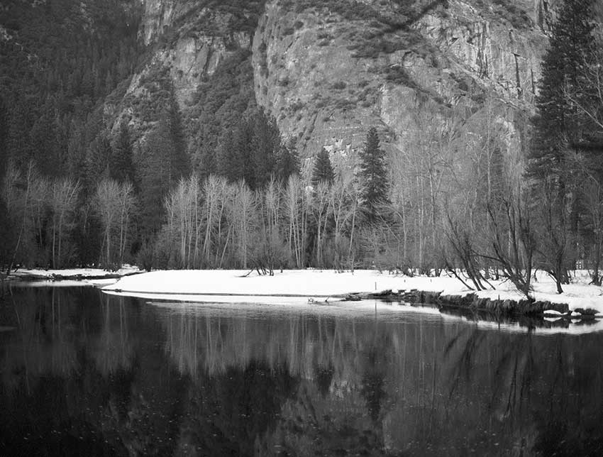
- Location
- yosemite, california
- Equipment Used
- contax 645 with planar 2/80
- Film & Developer
- ilford delta 400/super prodol 1:4
- Paper & Developer
- neg scan/coolscan 9000
| Photrio.com contains affiliate links to products. We may receive a commission for purchases made through these links. To read our full affiliate disclosure statement please click Here. |
PHOTRIO PARTNERS EQUALLY FUNDING OUR COMMUNITY:  |