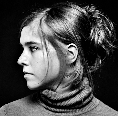
Another portrait of Emma. I thought she looked quite detemined.Have tried to be more subtle on the skin tones this time. Again I can see a better picture with the crop but i did not want to lose her hair.
I'm not sure if what I'm seeing is an artifact of scanning or posting, monitor gamma, original image or whatever, but the contrast is disturbing to me in these images. I also looked back on your mannequin photo and the other picture of Emma and further see that you apear to like the black background very much.
I agree with several of the comments made so far regarding the compositional aspects of the image(s) but also take issue with a couple statements. I would not disregard much of what Ornello has said if you can get around the aloof manner in which he posted. I believe he has made several good points.
However, I disagree with him strongly about the technical aspect, largel because of the contrast problem I'm seeing on my screen. If it is not there in the actual print, please consider what I'm saying as a suggestion on getting the scanned images to look better onscreen.
There are areas of total blackness that encroach into portions of the image where I would like to see detail and tone. I suspect you are underexposing the film and overdeveloping it losing detail and gaining contrast as a result. Shadows in the shirt and hair are merging tonally with the background. The eyes have no differentiation between pupil and iris, catchlight is nearly missing, etc. Dark details have not been recorded, or if they have, they are not showing onscreen. Your dark shadow areas are nothing but black holes.
Assuming your intent is to produce a relatively normal rendition and not some abstract poster, I would suggest your images could be improved by getting more detail in the darker areas. Unless you go to the moon (look at some NASA astronaut photos on the lunar surface), shadows will have some tone or texture to them because of the atmosphere causing the light to diffuse, if ever so slightly. A good photograph usually has some very small areas of pure black (e.g., a hole in a wall of an unlit interior room photographed from outside) which serve to key the other values but in your photos there are very large areas that are this pure black. The bottom rear of her head disappears and merges into the background for example. That just isn't how things look naturally. Look around your surroundings and try to find the darkest area-you will still be able to see or get an indication of something there especially if the lighting is intense as it is in your photos. Even low-key, darkly-printed subjects show this effect. (Check out some of the work by Eduard Steichen for example.)
One of the things I've found very helpful in remembering this comes from an instructional text on painting I once read. The author, a prominent contemporary portraiturist in oils, suggesting painting the air, not the object, in front of you. I would extend this to say photograph or at least see the air in front of you. Throw a little light on that black background in a few spots to get something other than a void to be there. You don't need much, just a little to separate the subject from the background. Use a reflector to throw a bit more light into your sitter's shadowed areas to give them a sense of substance and solidity. I think this suggestion also applies to your flower shots. Your book photos are much more appealing because there is light and solidity in both the subject and background.
OTOH, don't just flood the scene with light either. That makes for the problem seen in many low-budget video productions. Throwing light everywhere destroys form and mystery.
I'd suggest cutting your ISO setting in half and reducing your film development a bit as well. This should help give you more shadow detail and prevent your highlights from blowing out as other have remarked.
You have a wonderful subject and a good sense of line in all your photos. Keep shooting and posting.
As an off-topic comment--"How do I activate paragraph breaks"--this has been a question in my mind for a while. Oddly, they are there. When I checked your user ID page:
http://www.apug.org/gallery/member.php?uid=7447
I see this comment by you with the formatting you intended. However, in the gallery, it is a big single paragraph.
Photrio.com contains affiliate links to products. We may receive a commission for purchases made through these links. To read our full affiliate disclosure statement please click Here.
PHOTRIO PARTNERS EQUALLY FUNDING OUR COMMUNITY:
This site uses cookies to help personalise content, tailor your experience and to keep you logged in if you register.
By continuing to use this site, you are consenting to our use of cookies.