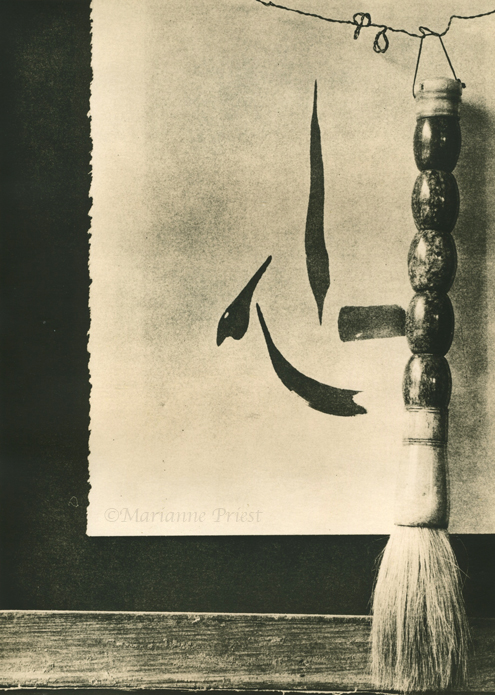
Marianne: I think this composition has a very Zenlike thing going on. It looks like it needs a little more exposure near the bottom of the calligraphy piece, or maybe that is just the scan. I like it.
Dan
dan, thanks for the comments.
i am going to try both of these again when my fomabrom IV 123 paper arrives.
this was in the arista developer for 25 minutes. the print is just plain bad and i think
you are right that black along the bottom, just above the wood frame needs more exposure.
if i get anything good next time, i will post it.
Photrio.com contains affiliate links to products. We may receive a commission for purchases made through these links. To read our full affiliate disclosure statement please click Here.
PHOTRIO PARTNERS EQUALLY FUNDING OUR COMMUNITY:
This site uses cookies to help personalise content, tailor your experience and to keep you logged in if you register.
By continuing to use this site, you are consenting to our use of cookies.