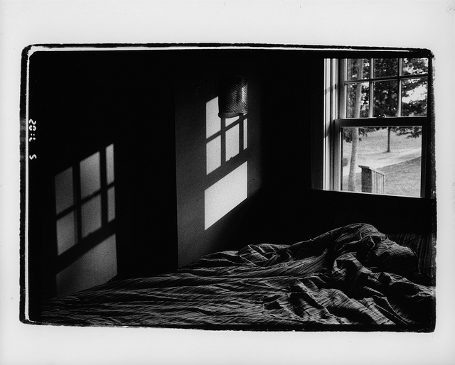
Good work in printing. When the scene was flipped horizontally in the other direction, for some reason it flowed better to me, which is interesting, since I'm a Westerner and read left to right.
The 'frame' is a bit distracting, yes. But not enough to take a lot away from the whole scene. I like your print a lot.
It looks well worth getting up to capture. I like the print, and the emphasis on the exterior exposure seems right, but for me the inclusion of the digital numerals distracts form the sense of timelessness. I'd include these only if it adds "meaning" in some way.
i very much like the contrasts here: inside/outside, darkness/light, ruffled/orderly, enclosed/open. i'm not sure why, but my eye goes to and stays on the scene outside the window, even though it only occupies a small part of the frame. again, i'm not sure why, but something about the image is also quite disturbing to me; perhaps it's the overall darkness/use of dark tones, but that's not to say i'm not attracted to the image or pulled in by it. well done!
Photrio.com contains affiliate links to products. We may receive a commission for purchases made through these links. To read our full affiliate disclosure statement please click Here.
PHOTRIO PARTNERS EQUALLY FUNDING OUR COMMUNITY:
This site uses cookies to help personalise content, tailor your experience and to keep you logged in if you register.
By continuing to use this site, you are consenting to our use of cookies.