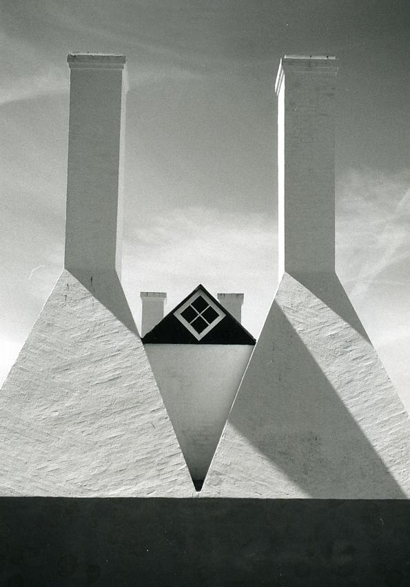
Well seen and captured!
Only the big black bar (shadow?) at the bottom I find a bit distracting, perhaps a bit smaller? Only 1 cm? Or totally without the bar?
Just my 2 c.
I agree with 'mono' regarding the thickness of the black strip on the bottom. If you went to the trouble of printing your negative why did you negelect to spot it before scanning it. I should add that I think that it is a terrific architectural shot.
I disagree about the black stripe on the bottom. I find that it anchors the picture very well, and provides some negative space for the frame to rest on.
Love the composition and the treatment. However, I do think the verticals should be 100% vertical, and the horizontals, 100% horizontal. On this monitor, they're just a hair off.
I think I like the thickness of the shadow area at the bottom. It adds a base to the composition and seems to "fit" with the other elements. But I agree with Tex about spotting the print, and I also agree that this composition requires perfect horizontals and verticals to work. But it is very well conceived and composed.
I find it a bit far-fetched that the shadow "grounds" the image. I think the image works even without the shadow! It works more as an abstract detail of the building then. Though I admit it should have "100% verticals and 100% horizontals" as said above.
Photrio.com contains affiliate links to products. We may receive a commission for purchases made through these links. To read our full affiliate disclosure statement please click Here.
PHOTRIO PARTNERS EQUALLY FUNDING OUR COMMUNITY:
This site uses cookies to help personalise content, tailor your experience and to keep you logged in if you register.
By continuing to use this site, you are consenting to our use of cookies.