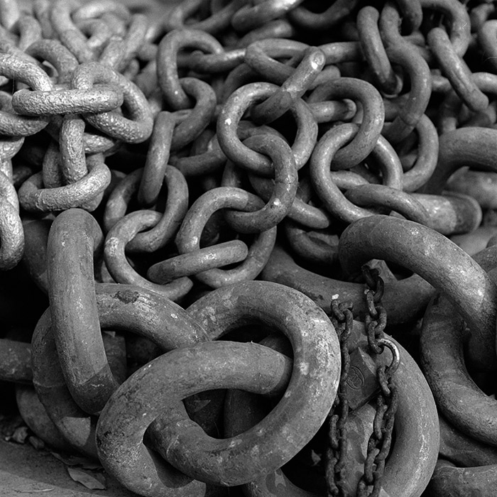
Actually I do not like the tones. This photo really can benefit from more careful printing. I think "burning the edges and top left is needed.
The contrast is very flat. I wonder if the print is underdeveloped. I do not know your experience level, and I do not mean to be harsh. Just giving a bump for growth. If I have offended I am sorry.
This print or photograph needs more separation between the shadows and highlights. Anyway I hope my comments are of some help. Keep up the work! I should just get off the computers (most of my work has been digital for a few years now)... and get into the darkroom
Thanks to all for taking the time to comment about this photo.
If I've offended any by posting a scanned image I'm sorry, I took APUG to mean Analog Photography Users Group, not Analog Printer Users Group. I'm in the early phases of printing and will post scans of them as I print them.
Photrio.com contains affiliate links to products. We may receive a commission for purchases made through these links. To read our full affiliate disclosure statement please click Here.
PHOTRIO PARTNERS EQUALLY FUNDING OUR COMMUNITY:
This site uses cookies to help personalise content, tailor your experience and to keep you logged in if you register.
By continuing to use this site, you are consenting to our use of cookies.