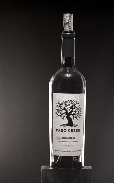
Looks good to me. Let me make one suggestion though, if I may. There is a light spot off to the left. Typically, you want that light spot behind the bottle, creating a little extra emphasis on the subject. This can be done either by engineering your light or by burning in the edges. If you are shooting b&w then d&b works well. For my taste it has to be very subtle though, these days we see too many really unsubtle halos.
Not sure about the hot spot on the shoulder of the bottle, looks like a reflection of a room light or something. If it is intentional, fine, if not then - since this is a controlled lighting setup - it shouldn't be there.
On the right hand side I would prefer to see greater separation between the label and the highlight on the glass.
Am I being picky? Probably but the problem is pictures like this done with text book perfection are very common in advertising for this type of product so the viewer's expectations tend to be set quite high.
Thank you for the critique. I don't mind being picky. The purpose of this exercise is to learn so any help I get here is appreciated.
The light on the shoulder is indeed an overhead light that was left on by mistake....
I would have liked more space between the edge of the label and the highlight but the label was so wide that it covered so much of the bottle that I could not seem to get more separation.
Photrio.com contains affiliate links to products. We may receive a commission for purchases made through these links. To read our full affiliate disclosure statement please click Here.
PHOTRIO PARTNERS EQUALLY FUNDING OUR COMMUNITY:
This site uses cookies to help personalise content, tailor your experience and to keep you logged in if you register.
By continuing to use this site, you are consenting to our use of cookies.