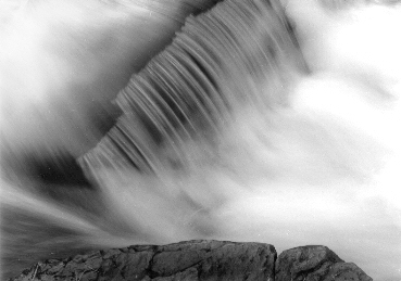
Nice abstract picture. i'd suggest to print the left upper part and right down part with a lower contrast grade and adding some compensating exposure.
Consider gold toning to suggest a blue hue.
I like your image a lot... I'd like to see one without the rock at the bottom (although I'm not sure it would be better, just different)... Without the rock grounding the bottom of the composition I think it might be a bit more high-key, soft and more abtract... Again, I'm not sure it would be better though... It is a real nice image as it is anyway...
I really like the abstract nature of the waters flow and movement Jeanette, but I agree with ceratto - without the rock would be more interesting. Its a shame the central diagonal feature of the water flow is clipped off at the top - It would have been a more pleasing composition if there were a little amount of space above this.
there is some great room for excellent fine highlight tones in this shot - nice for some very careful spilt sepia toning to the highest values.
Jeanette I love this one and that water is beautifully silky. I like the rock at the bottom as for me it provides a good base and gives it a more 3 dimensional effect
Photrio.com contains affiliate links to products. We may receive a commission for purchases made through these links. To read our full affiliate disclosure statement please click Here.
PHOTRIO PARTNERS EQUALLY FUNDING OUR COMMUNITY:
This site uses cookies to help personalise content, tailor your experience and to keep you logged in if you register.
By continuing to use this site, you are consenting to our use of cookies.