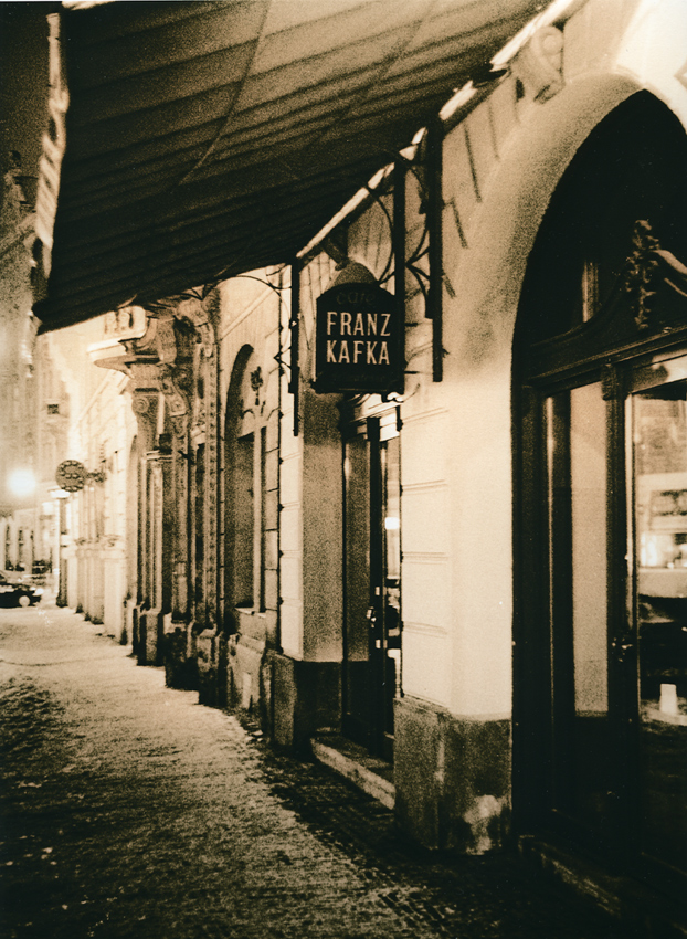
Vic- I like this one better. The main reason is due to the added shadow area, on the sidewalks lower left. It helps lead the eye into the image. It also helps balance the shadow areas in the building. The "S" sign also has more pop. Great photo, by the way...
I vote for this one, dear Vittorio, and I like it A LOT. This one fully retained the feel of night light and with a perfect balance of warm and cold. The other one maybe needs a bit more exposure but the gold toning certainly cools everything off and gives a totally different look.
I think this one works better. The denser areas of the negative printed with more detail and lower values making for a more solid feeling while the darks in the print reflect more light back. So more highlight detail, better midtones, and more feeling of light. Maybe lowering the contrast of the other one would yield similar results. Nice shot.
This would be my choice as well. Your other version is dominated by the two hi-lights at the front and back of the photo dividing your picture into sections. This version runs smoothly from front to back as a complete photo helping the viewer to pick out different details throughout.
I vote for this one, dear Vittorio, and I like it A LOT. This one fully retained the feel of night light and with a perfect balance of warm and cold. The other one maybe needs a bit more exposure but the gold toning certainly cools everything off and gives a totally different look.
Photrio.com contains affiliate links to products. We may receive a commission for purchases made through these links. To read our full affiliate disclosure statement please click Here.
PHOTRIO PARTNERS EQUALLY FUNDING OUR COMMUNITY:
This site uses cookies to help personalise content, tailor your experience and to keep you logged in if you register.
By continuing to use this site, you are consenting to our use of cookies.