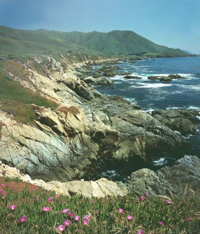
I can still see the haze but if it was there, then show it. I'd agree with Thomas' two comments but the slight blueness doesn't bother me and I like the slightly muted colours. Maybe that is the hazy day effect but if so it's worked in your favour.
Slides can so easily look over the top in terms of colour saturation. Like 1950s technicolor Westerns or dare I say it, like the Dick Tracy primary comic colours so beloved of our digi friends.
I think that it is too cyan. Actually cyan would be a color that would cool things down. I would back out about 5-10 units of cyan and see how it looks to you then.
It may be a bit too blue, but the color really reminds me the color work in the "Edward Weston Color Photography" exhibit catalogue that I recently found. I actually like the cyan.
The tilt is a little distracting, but not that bad IMO.
maybe it's too blue, but it sure does jump out at me as being true to life. I don't know why but I think if you warm it up some it'll look like the postcards, if you leave as is it looks like real life.
Photrio.com contains affiliate links to products. We may receive a commission for purchases made through these links. To read our full affiliate disclosure statement please click Here.
PHOTRIO PARTNERS EQUALLY FUNDING OUR COMMUNITY:
This site uses cookies to help personalise content, tailor your experience and to keep you logged in if you register.
By continuing to use this site, you are consenting to our use of cookies.