


![Kinga [Nude]](/forum/data/xfmg/thumbnail/1/1819-3fa46210baf2417b536865a3df193245.jpg?1649554522)


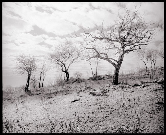
Almond Trees (reprinted)
- Location
- Siatista, Western Macedonia, Greece
- Equipment Used
- Bronica SQ-A
- Exposure
- 1/4sec, f22
- Film & Developer
- Delta 100 and Ilfosol 1+14
- Paper & Developer
- WTFB, Multigrade and Selenium toned
- Lens Filter
- Yel Grn
| Photrio.com contains affiliate links to products. We may receive a commission for purchases made through these links. To read our full affiliate disclosure statement please click Here. |
PHOTRIO PARTNERS EQUALLY FUNDING OUR COMMUNITY:  |