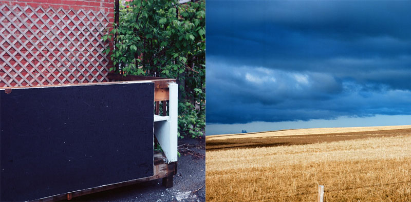


A similar point of view?
- Location
- Here and there
- Equipment Used
- Cameras
- Exposure
- Different
- Film & Developer
- Not identical
- Paper & Developer
- Both scanned
| Photrio.com contains affiliate links to products. We may receive a commission for purchases made through these links. To read our full affiliate disclosure statement please click Here. |
PHOTRIO PARTNERS EQUALLY FUNDING OUR COMMUNITY:  |