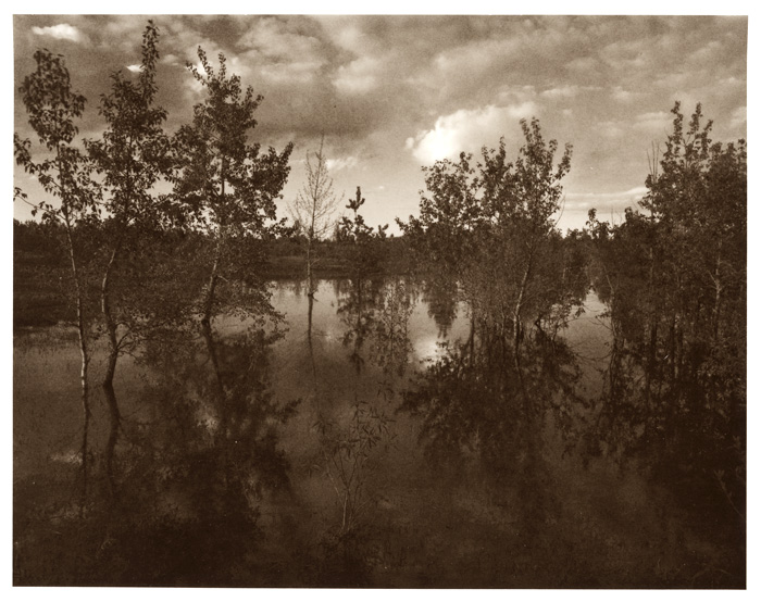


A funny little pond (lith)
-
A
- walter23
- Location
- Calgary
- Equipment Used
- Shen Hao & Rodenstock 90mm
- Film & Developer
- FP4+ in ID-11
- Paper & Developer
- Maco lith paper in LP-superlith
| Photrio.com contains affiliate links to products. We may receive a commission for purchases made through these links. To read our full affiliate disclosure statement please click Here. |
PHOTRIO PARTNERS EQUALLY FUNDING OUR COMMUNITY:  |