Is EDN v2.2 worth the effort? Here's my story...

Recent Classifieds

Forum statistics

Threads
201,040
Messages
2,818,034
Members
100,492
Latest member
tsang28
Recent bookmarks
2

zuluz

Member
Allowing Ads
Joined
Mar 24, 2023
Messages
31
Location
Palo Alto
Format
35mm
I recently wanted to try Mike Ware's 2019 'simple' cyanotype process and decided to calibrate everything using Peter Mrhar's EDN v2.2 software. I'm using a Canon PRO-100 so other Epson-centric solutions weren't an option. So I enter a 3-4 month rabbit hole...

My goal was simple: get a reasonable approximation of what I see on my monitor on print. The end result was that after numerous trials I consistently got the same calibration LUTs, for color, compensation, and screen proof, but it was off. So, either I was doing something wrong, or EDN was. I first tried to make sense of the EDN code, but reading the raw javascript code didn't get me very far, so I started checking my process.

I decided to settle on sRGB as my color space throughout the process, so I calibrated my monitor for sRGB, and made sure all photoshop documents were also using sRGB. I found the hard way, especially when moving photos from Lightroom to Photoshop that one has to know exactly what color space is being used otherwise the EDN generated LUTs (or at least the screen proof one) was going to be off.

The scanner I use is a Canon officejet 8600, which seems to be good enough, but it wasn't super clear what color space it uses. When using the standalone scanner tool it seems to use 'Generic RGB' profile, and when importing directly to Photoshop it seems to properly convert to sRGB. So I think I'm good there.

The color EDN picked for me for the negatives was H=330, pretty consistently. I also did some tests for paper type profile, and ended up using 'matte' which had better UV blocking.

I went through an excessive amount of paper and pictorico transparencies to do the main EDN procedure. My chemistry, papers, transparencies, and printer were constant and I got a pretty consistent set of compensation and screen-proof LUTs. The linearized comp curve was this:

Screenshot 2023-07-30 at 1.41.20 PM.png


However, my prints were consistently too washed out, too light, compared to what I was seeing on my monitor. At the end, I had to create my own compensation curve on top of EDN's screen-proof, by trial and error and using my eyes, to get it right. I'm now pretty happy with the results, but the whole point of using EDN for me was to get here without having to manually adjust it.

The manual compensation I had to add to EDN's screen-proof to make it match my prints is something like this, which is pretty drastic.

Screenshot 2023-07-30 at 1.36.37 PM.png


This of course means that I have to re-adjust the images with the new screen-proof layer which is not optimal. I may at some point reverse engineer this into the linearization adjustment.

So, I have no idea why EDN didn't work for me out of the box. I tried my best to check every step of the way to make sure I wasn't doing something wrong. I didn't have the patience to figure out the EDN javascript code, so I'm just going to conclude I am doing something wrong.

Please share your experience with EDN whether you've had similar issues or have been more successful.
 
Last edited:

revdoc

Member
Allowing Ads
Joined
Apr 12, 2015
Messages
306
Format
35mm
I don't think your issue is with EDN; it's with trying to make prints to match your monitor. No digital negative method knows what your monitor looks like. They only see a scan of a print. To achieve your goal, you have to either calibrate the negative to the monitor, or the monitor to the print. Both will be manual processes.

(In fact, I originally tried matching the monitor image myself, but eventually realised that I needed to apply a curve on-screen for it to work. That's where you are now.)

I believe PS has a feature called filter layers that you can use to apply your proofing curve with minimal effort.. You might try that first. Otherwise, you'll probably have to adjust your monitor profile. That's a subject I know nothing about.
 

Rolleiflexible

Member
Allowing Ads
Joined
Mar 22, 2005
Messages
2,194
Location
Mars Hill, NC
Format
Multi Format
However, my prints were consistently too washed out, too light, compared to what I was seeing on my monitor.

I don't think your issue is with EDN; it's with trying to make prints to match your monitor.

A lot of both of your posts is beyond me, and I am in the Epson/QuadToneRIP space so my experience is not so pertinent here. But I will say that QTR and Richard Boutwell's program, QuickCurve-DN, together do what @revdoc says is not possible: They generate negatives for prints that look much like what you see on your monitor.

Whether EDN is the source of your problem, I do not know. In the end, I bought an Epson printer to enable me to make use of the accumulated knowledge base that has grown up around QTR and programs like Mr. Boutwell's.
 
  • zuluz
  • Deleted
  • Reason: not sure

nmp

Member
Allowing Ads
Joined
Jan 20, 2005
Messages
2,054
Location
Maryland USA
Format
35mm
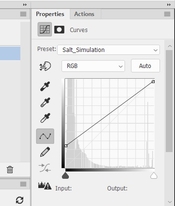
Your monitor (and your original image) goes from 0 to 255 whereas your actual printed image goes from Dmax to Dmin (in RGB numbers) so the print will never look like what you see on the screen even as your monitor and scanner are calibrated properly. Easy way to see what your final print is going to look like is to open the image in PS and add a Curves layer with a straight line at (0, Dmax) to (255, Dmin) where Dmax is the avg RGB value of the darkest step and Dmin is the avg RGB value of the brightest step. For example for my salt prints it is (0, 62) and (255, 250.) So the curve looks like this:

Simulation Curve.jpg

Resulting image is how the print will look like if your correction curve is perfect.
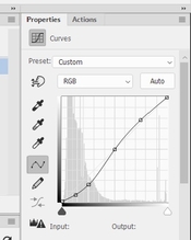
To counter this perceived loss of contrast, I add a compensating Curves layer on top of the image adding contrast, primarily in the shadows (not overdoing it as it will result in clumped shadows):

Contrast Enhancement Curve.jpg

Each image will get its own tweaking of this curve with the above simulation curve activated so you can see in the final print will change accordingly.

Having said that, I don't understand if your print is washed out (which I take it as lacking contrast) you are simply making your image brighter by adding the curve shown above. May be I am missing something. Is the curve added after inversion?


:Niranjan.
 

Rolleiflexible

Member
Allowing Ads
Joined
Mar 22, 2005
Messages
2,194
Location
Mars Hill, NC
Format
Multi Format
Your monitor (and your original image) goes from 0 to 255 whereas your actual printed image goes from Dmax to Dmin (in RGB numbers) so the print will never look like what you see on the screen even as your monitor and scanner are calibrated properly.

Obviously this is correct. The difference is smaller for my medium (kallitypes) than for yours (salt prints) because kallitypes have greater dmax. In both, the darks never quite go down to what you see on a monitor.

When the OP said the prints looked "washed out," I took that to mean that the tonal scale of the prints (not just the dmax) was significantly lighter than the tones shown on the monitor. That (unlike dmax) is not a limitation of the medium. That is a failure of calibrating negatives to the process. In the Epson/QTR space, that should not happen.
 

koraks

Moderator
Moderator
Joined
Nov 29, 2018
Messages
25,923
Location
Europe
Format
Multi Format
The difference is smaller for my medium (kallitypes) than for yours (salt prints) because kallitypes have greater dmax.
Sorry for the off-topic, but I really doubt the veracity of this statement.
I have, however, seen many salt prints with low dmax due to the use of negatives lacking in contrast, use of inappropriate paper and basically a lack of awareness of the true capabilities of the medium. Having spent quite some time on optimizing salt prints a few years ago, I reached the conclusion that salt prints produce dmax quite close to matte surface silver gelatin, especially when gold toned (but also untoned).

Anyway, the whole dmax/dmin vs. 0-255 digital scale thing is to the best of my knowledge a moot point if the linearization tool normalizes the digital readings before applying the linearization algorithm. To the best of my knowledge, all linearization tools do this, because they would be virtually unusable otherwise. This means that regardless of the exact dmax and dmin of the process, the numbers series the linearization tool works with will always be mapped to the full-range 0-255 (or 0-65535 or whathaveyou) digital scale used.

The problem with terminology like 'washed out' is that it is ill-defined. For clarification, some photos of prints and/or printed step wedges and preferably density measurements would be included. I accept that the latter may be beyond the means of many.

No digital negative method knows what your monitor looks like.

Sure, but this is basically irrelevant. There's always the difference in real-world contrast ratio between a computer monitor and the reflective density contrast range of a printed medium. Yet, most computer displays, even uncalibrated, will show a fairly good (linear) step wedge. If used and designed properly, any linearization tool should allow this to be replicated in the printed medium. This, however, requires quite a few things, including really good process control and reliable measurement methods. There are many pitfalls hiding behind just these two conditions!
 

Rolleiflexible

Member
Allowing Ads
Joined
Mar 22, 2005
Messages
2,194
Location
Mars Hill, NC
Format
Multi Format
Sorry for the off-topic, but I really doubt the veracity of this statement.
I have, however, seen many salt prints with low dmax due to the use of negatives lacking in contrast, use of inappropriate paper and basically a lack of awareness of the true capabilities of the medium.

Koraks, thanks for the correction. I have not made salt prints. The ones I have seen seemed lacking in the shadows and I assumed it to be a shortcoming of the process. Apologies for adding to the misinformation.
 

nmp

Member
Allowing Ads
Joined
Jan 20, 2005
Messages
2,054
Location
Maryland USA
Format
35mm
Koraks, thanks for the correction. I have not made salt prints. The ones I have seen seemed lacking in the shadows and I assumed it to be a shortcoming of the process. Apologies for adding to the misinformation.

I for one take no exception to your statement. My salt prints, which are untoned, indeed seem to have a lower Dmax than your Kallitypes - as I see on the scan you share. I have tried many different permutations and combinations of process/materials variables (on the same paper COT 320) etc but they seem to have a ceiling of about 60-65 in the AdobeRGB space (per my scanner calibrated to Colorchecker 24) and L* values ranging from 22-25 or so (as measured with ColorMunki Photo.) I have seen many salt prints (and also other processes like cyanotypes) that have higher Dmaxes online but some even have a histogram ranging from 0 to 255 which is obviously not possible for a matte paper - so they are suspect in my mind. Others like Ellie Young show data of L's as low as 12 - but I have no clue how one can get such high Dmax's. That is close to what one would get in a digital print with carbon inks on a glossy surface. In my experience any effort in higher Dmax than what I get end up in solarization with the tone moving to a kind of greenish grey color, which I do not care for. @koraks' might as well be as high as he says - I would love to see a print in person (may be he can send me one in the exchange) so I can figure out theoretically what is possible.

:Niranjan.
 
Last edited:

koraks

Moderator
Moderator
Joined
Nov 29, 2018
Messages
25,923
Location
Europe
Format
Multi Format
may be he can send me one in the exchange

I'll give it a thought, but I'm more focused on carbon, presently.
Paper choice was absolutely critical. I never tried COT320, but I've tried many papers and only on one or two I got what I considered decent dmax. The rest was all 'meh'. The paper I did most of mine on was Schut Simili Japon, which is a rather warm/yellowish paper base, with a surprisingly smooth surface (for an etching/art paper).
 
Last edited:
  • nmp
  • Deleted
  • Reason: Post was moved

nmp

Member
Allowing Ads
Joined
Jan 20, 2005
Messages
2,054
Location
Maryland USA
Format
35mm
Anyway, the whole dmax/dmin vs. 0-255 digital scale thing is to the best of my knowledge a moot point if the linearization tool normalizes the digital readings before applying the linearization algorithm. To the best of my knowledge, all linearization tools do this, because they would be virtually unusable otherwise. This means that regardless of the exact dmax and dmin of the process, the numbers series the linearization tool works with will always be mapped to the full-range 0-255 (or 0-65535 or whathaveyou) digital scale used.

I am sorry, but that is not a moot point. Linearizaation only maps the original image to the new tonal scale. The fact that the final print does not have the same 0-255 scale, even as the mapping may be perfect, has nothing to with whether or not linearization was improper or not. The dmin is governed by the paper white so it will never be 255. And the Dmax is governed by how much density can be mustered by the the process characteristics. It will never be zero if scanned properly calibrated against known standard. So even though it seems you are mapping with the full tonal scale (that is due, as you mention, to first normalizing the print to make the boundaries match those in the image, i.e. 0 to 255) the print really does not have the full density range of the screen image. That is usually responsible for the disappointment when holding the print for the first time.

:Niranjan.
 

koraks

Moderator
Moderator
Joined
Nov 29, 2018
Messages
25,923
Location
Europe
Format
Multi Format
The dmin is governed by the paper white so it will never be 255.

Depends on how you scan it. You can scan it to be 255, or 200, or 1. It's arbitrary from a digital perspective. There's no fixed relationship between optical density of a reflective material and a digital 8-bit representation of 'something'. Bytes don't know what they represent!

if scanned properly calibrated against known standard

That's one of the conditions I hinted at in my post. A desktop scanner out of the box generally does not work this way. Most desktop scanners auto-adjust exposure (or digital gain).
But for monochrome work, this doesn't matter as long as the scanner is working in its linear region, nothing of the tonal scale of the print is lopped off in scanning and the scanned data are normalized.

the print really does not have the full density range of the screen image

Sure, but I don't think this is the problem @zulus is running into. Given the manual adjustment curve he adds, which improves matters, the problem seems to be in the linearization part. I suspect @zuluz understands that the apparent contrast of a print is lower than that of a computer monitor.
 

nmp

Member
Allowing Ads
Joined
Jan 20, 2005
Messages
2,054
Location
Maryland USA
Format
35mm
I'll give it a thought, but I'm more focused on carbon, presently.
Paper choice was absolutely critical. I never tried COT320, but I've tried many papers and only on one or two I got what I considered decent dmax. The rest was all 'meh'. The paper I did most of mine on was Schut Simili Japon, which is a rather warm/yellowish paper base, with a surprisingly smooth surface (for an etching/art paper).

Yeah, paper is definitely a big factor and so far I have limited myself to COT 320 (not counting my salt-free process on Arches Aquarelle, but that's another story.) At some point I will try out others like HPR and Revere Platinum and see if I can squeeze out greater density, although I am satisfied with what I have - I guess you have to have "convincing blacks" not absolute blacks to get a good image.

:Niranjan
 

nmp

Member
Allowing Ads
Joined
Jan 20, 2005
Messages
2,054
Location
Maryland USA
Format
35mm
Depends on how you scan it. You can scan it to be 255, or 200, or 1. It's arbitrary from a digital perspective. There's no fixed relationship between optical density of a reflective material and a digital 8-bit representation of 'something'. Bytes don't know what they represent!

That's the problem of the most representation you see online. You should not scan it to go 0 to 255. Otherwise all prints look perfect, that would make Ansel Adams proud with darkest darks and whitest whites.

That's one of the conditions I hinted at in my post. A desktop scanner out of the box generally does not work this way. Most desktop scanners auto-adjust exposure (or digital gain).
But for monochrome work, this doesn't matter as long as the scanner is working in its linear region, nothing of the tonal scale of the print is lopped off in scanning and the scanned data are normalized.

True when making negatives, but I am not sure if the self-correction by the scanners can be relied upon. Sometimes they are too aggressive in chopping off information at the extreme ends. I would rather do my own normalization using Excel which is simple enough to do.

Sure, but I don't think this is the problem @zulus is running into. Given the manual adjustment curve he adds, which improves matters, the problem seems to be in the linearization part. I suspect @zuluz understands that the apparent contrast of a print is lower than that of a computer monitor.

We will know what the actual problem is if OP shares some pictures. But I didn't understand why if the print was too light, using a curve that further lightens it worked to correct it. But we should wait for California to wake up....🙂

:Niranjan.
 

koraks

Moderator
Moderator
Joined
Nov 29, 2018
Messages
25,923
Location
Europe
Format
Multi Format
I would rather do my own normalization using Excel which is simple enough to do.

Me too. I also noted that for color work, a scanner didn't quite cut it and an actual color densitometer or photospectrometer is necessary. For monochrome work, a scanner is just fine, but I agree care should be taken that nothing is cut off of the tonal scale!

We will know what the actual problem is if OP shares some pictures.

Absolutely!

But I didn't understand why if the print was too light, using a curve that further lightens it worked to correct it.

I think the curve is a correction curve on the negative, so the print will produce (more or less) the opposite curve.
 
  • fgorga
  • Deleted
  • Reason: Post was moved

fgorga

Member
Joined
Aug 31, 2015
Messages
819
Location
New Hampshire
Format
Multi Format
Any words of advice to @zuluz on linearization?

Not really. I am very 'old fashioned' and have never tried any of the (semi)automated tools.

I have been making digital negatives since long before these tools existed. . I make curves 'by eye' and don't worry about perfect linearity.

If I am starting from scratch, I start with a step tablet and when I get close I switch to an actual image. These days, I rarely start from scratch. Rather, I start with a 'found' curve. Print an image and adjust from there.

Probably more importantly, I customize the shadows and highlights of each image I print separately. I do this by dodging and burning on the image before inverting and printing a negative rather than with a curve. In other words, the curve gets me close and then I treat each individual image uniquely to fine tune the ends.

I do all of this fine tuning by making small test prints (4x5 image on a small sheet of paper) before committing to a larger negative/print.

Trying to match a print to your screen is useless in my view. Images produced via an emissive mechanism will never exactly match an image produced by reflective light.

The proof is in the print! Use the tools on has to get as close as you can in a first draft. Then rely on your eye.

Lastly, remember that there is no single correct answer for how any print should look. The eye and intent of the artist is paramount.

As old Saint Ansel said "The negative is the score, the print is the performance." In the digital era, the negative is also the score as, to continue the musical analogy, we can adjust the key in which the score is written to anything we wish before we commit to a performance. This is one of the great powers of digital negatives.

As I read this over, I realize that my first sentence is clearly NOT true. I have plenty of advice, just not about the (semi) automated tools! 🤪
 
OP
OP

zuluz

Member
Allowing Ads
Joined
Mar 24, 2023
Messages
31
Location
Palo Alto
Format
35mm
Great discussion and a ton of useful info. I realize I may not have properly presented my issue. I'm not (yet) convinced that there's anything wrong with EDN's linearization. My issue is with its generated screen proof. Looks like not many have actually tried using EDN here, but what you get are two things: 1) the linearization curve in various formats (I use the LUT 1D), and 2) the screen proof as a LUT 3D.

Maybe I'm missing something fundamental, but my assumption is that the screen proof should be linear, but it isn't. The manual adjustment I made was to the screen proof, and I came up with an approximation to linear.

To go about it another way, I decided to take the 256-chart in EDN, add the screen proof LUT to it, and then have EDN analyze the chart to see how linear it is. Here's the result


test-proof.jpg
Screenshot 2023-08-01 at 9.44.41 PM.png


it's kind of similar to the manual adjustment I made by hand. I'm not sure how to explain this.

Hope this is a little more clear.
 
Last edited:

nmp

Member
Allowing Ads
Joined
Jan 20, 2005
Messages
2,054
Location
Maryland USA
Format
35mm
Great discussion and a ton of useful info. I realize I may not have properly presented my issue. I'm not (yet) convinced that there's anything wrong with EDN's linearization. My issue is with its generated screen proof. Looks like not many have actually tried using EDN here, but what you get are two things: 1) the linearization curve in various formats (I use the LUT 1D), and 2) the screen proof as a LUT 3D.

Maybe I'm missing something fundamental, but my assumption is that the screen proof should be linear, but it isn't. The manual adjustment I made was to the screen proof, and I came up with an approximation to linear.

To go about it another way, I decided to take the 256-chart in EDN, add the screen proof LUT to it, and then have EDN analyze the chart to see how linear it is. Here's the result


View attachment 345511View attachment 345512

it's kind of similar to the manual adjustment I made by hand. I'm not sure how to explain this.

Hope this is a little more clear.

I tried EDN long time ago (the first version) where he used Gradient Map layer that I was not a big fan of. I think Curves is much better as you can see what is going on intuitively. Gradient Map is a bit of a black box visually. For the same reason I am not a fan of LUT's also - you don't know what is going on under the hood either. You can't tweak it manually. For that you still have to resort to Curves.

Anyway, I am not sure exactly how this Screen Proof works. May be I will go through the latest version later when I have time and understand a bit more.

I am still fuzzy on one issue though that we discussed above - which is why if
your "prints were consistently too washed out" you were able to solve the problem by adding a curve that would have lightened the print further. Was this layer added to the negative? To the positive on top of the LUT layer? Or bottom? Inquiring minds wanna know!

:Niranjan.
 

koraks

Moderator
Moderator
Joined
Nov 29, 2018
Messages
25,923
Location
Europe
Format
Multi Format
Anyway, I am not sure exactly how this Screen Proof works.

Me neither, and I'm not sure if/why it would be necessary (apart from perhaps colorizing an image etc.) I see how soft proofing comes into play if actual profiles are being created, but this is not the case.
 
OP
OP

zuluz

Member
Allowing Ads
Joined
Mar 24, 2023
Messages
31
Location
Palo Alto
Format
35mm
I tried EDN long time ago (the first version) where he used Gradient Map layer that I was not a big fan of. I think Curves is much better as you can see what is going on intuitively. Gradient Map is a bit of a black box visually. For the same reason I am not a fan of LUT's also - you don't know what is going on under the hood either. You can't tweak it manually. For that you still have to resort to Curves.
You're talking about the compensation (linearization) curve. EDN provides multiple formats, so if you prefer curves you can still use them. But for screen proof color, LUT seems like a reasonable choice.

I am still fuzzy on one issue though that we discussed above - which is why if
your "prints were consistently too washed out" you were able to solve the problem by adding a curve that would have lightened the print further. Was this layer added to the negative? To the positive on top of the LUT layer? Or bottom? Inquiring minds wanna know!

:Niranjan.
I would tweak the image to make it look good with the proof on monitor. Since the proof was too dark, my tweaks would make the print too light. I added my curve below the screen-proof LUT, not as part of the negative, and would then tweak the image if needed. I'm still trying to figure out if EDN is linearizing well, so let me reserve judgement on that until I do further tests.
 

nmp

Member
Allowing Ads
Joined
Jan 20, 2005
Messages
2,054
Location
Maryland USA
Format
35mm
You're talking about the compensation (linearization) curve. EDN provides multiple formats, so if you prefer curves you can still use them. But for screen proof color, LUT seems like a reasonable choice.

Now it does. Then (I am talking several years) it only had the Gradient Map, if I remember correctly. I was using ChartThrob at the time so I didn't see the reason to switch.

:Niranjan.
 

revdoc

Member
Allowing Ads
Joined
Apr 12, 2015
Messages
306
Format
35mm
My understanding of the "screen proof" is that it only tries to match the print colour. From the EDN page:

"The Screen Proof LUT 3D file is a high-quality file of 3-dimensionally presented LUT data. This file does not contain a correction, but a color scheme, which shows the final appearance of the positive image during the photo manipulation."

I can see why it might be useful for some people, but I don't use it. My prints are close to neutral black, and my laptop monitor can't be calibrated accurately.
 

nmp

Member
Allowing Ads
Joined
Jan 20, 2005
Messages
2,054
Location
Maryland USA
Format
35mm
My understanding of the "screen proof" is that it only tries to match the print colour. From the EDN page:

"The Screen Proof LUT 3D file is a high-quality file of 3-dimensionally presented LUT data. This file does not contain a correction, but a color scheme, which shows the final appearance of the positive image during the photo manipulation."

I can see why it might be useful for some people, but I don't use it. My prints are close to neutral black, and my laptop monitor can't be calibrated accurately.

It's same as what I do with a straight line curve (oxymoron!) as showed in post # 4 - minus the color. Similar to soft proofing for the conventional digital printing in Photoshop. We had a thread about it some time ago.

:Niranjan.
 
Photrio.com contains affiliate links to products. We may receive a commission for purchases made through these links.
To read our full affiliate disclosure statement please click Here.

PHOTRIO PARTNERS EQUALLY FUNDING OUR COMMUNITY:


Ilford ADOX Freestyle Photographic Stearman Press Weldon Color Lab Blue Moon Camera & Machine
Top Bottom