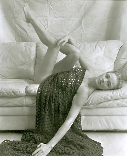
Such a cliche, but I can't help being annoyed by the cropped out hand. Maybe it's the scan, but there's an apparent lack of local contrast. It just seems a bit flat.
Lovely subject matter, your model seems to be rather relaxed. I can see how you've attempted a symmetrical balance between the arm and the legs in the way they point. Not a bad attempt, but I think with some improved printing, and a better crop it could be a wonderful image.
You are so close with this photograph, a bit more work and wow! The top hand is so very graceful, the bottom hand, makes me wonder where the grace went? lift the hand up onto the couch with the palm down with the same grace as the other one.
This will form a bend in the elbow, a V shape that leads your eye from the face and sholder right back to the main event. Crop the floor and everything below the bent elbow, and it will be more interesting.
Good luck! A great model!
Charlie........................
Guys I appreciated the comments
It is a work in progress I will be making more Negs I just wanted to see if I was getting there emotionally and statically I wanted the bottom hand to lead you out of the frame and touch you as it where.
At times it is nearly impossible for the viewer to accurately interpret what a photographer is trying to convey in a given image. The hand leading out of the frame is distracting, it appears that you were successful at what you were trying to do.
Have fun with your future endeavors!
Charlie...........................
I love tessar lenses for people pics. I think this is a great step in an evolution towards the final image. The only thing that bothers me is how the arm seems to prominent and the legs seem so distant. Is this lens a WA type for the format? I love your shots, they are ALL so interesting and thought provoking.
I like the high-key nature of this photograph. It's a very pleasant photo and would be happy to hang it on the wall. The missing fingers are a bit bothersome, but over all, very nice. Allan
I agree with the hand comment. I think the fishing net thing draped on her is the 'wrong' prop. The pose shows its awkwardness in the model and in the composition too. The backdrop wrinkles are distracting in a bad way to me. The whole image seems to be cobbled together without unity in texture, composition, feeling, content. Sorry Gustavo, two thumbs down from me; but that's just me.
Photrio.com contains affiliate links to products. We may receive a commission for purchases made through these links. To read our full affiliate disclosure statement please click Here.
PHOTRIO PARTNERS EQUALLY FUNDING OUR COMMUNITY:
This site uses cookies to help personalise content, tailor your experience and to keep you logged in if you register.
By continuing to use this site, you are consenting to our use of cookies.