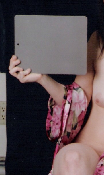
Where the gray card was when photographed - "moozed" (opposite of "zoomed") from previous upload. Previous gray card image isolated to prevent any possible perceptual influence from background/ surrounding color.
Color balance in printing established with ColorStar 3000
(actually a color densitometer).
Color looks quite good on my LCD monitor, taking a quick glimpse of the off color shot previously posted leads me to believe the automatic function in the Colorstar or possibly the scanner you use for uploading may be doing an average of the total color on each image rather than holding a good setting from a calibration image such as your grey card shot. Not knowing your workflow personally I can only guess, you know it way better than I do.
There is a marked difference between the color balance of this scene and the lady in green. The flesh tones look much more natural, and the gray card is dead on. I see a marked difference between this scene and the green lady- the backdrop on this one is black, whereas the backdrop on the other is white. While this shouldn't make a difference, I think it is much easier to color correct black than it is to correct white - a few cc's of filtration off are much less obvious with a black background than with a white one. If anything, the gray card looks a smidge red to me, but just a tiny bit. I'd suggest reprinting the green lady with about 5cc's less yellow and 10ccs more magenta. I'd also recommend getting a Macbeth color chart or a Jobo color chart (fewer colors, larger squares than the Macbeth, and cheaper too, making it easier to take readings from on your color analyzer). You may also be dealing with a crossover issue- I've had individual frames that were off by just enough on the exposure front that they developed a crossover that was impossible to correct - if you pushed it far enough filter-wise to fix one tint, another contrary imbalance popped up.
Ed these are simply observations, not solutions but I've looked at this, the Veil, Joy! and Diaphonous. Skin tones on both this and Diaphonous look similar and for what's it's worth, correct. Joy is less green looking than the Veil. Both of these have a white/green-greyish background respectively whereas this one and Diaphonous have a black background.
I can't think of why but could there be a connection?
I hope that you'll get this resolved. I have a vested interest in all of this. I have a Colourstar as well and any conclusions arrived at will help educate me.
Good luck and thanks for your previous help in my colour threads
I've spent some time studying the variability in color printing.
There is usually very little difference between the fist and last frames in a given roll of film. There is, in fact, very little difference between the first and last rolls of a given lot of film developed in a single batch of chemistry. Different BRANDS of chemistry can - and usually WILL produce different results.
The color temperature and spectral composition (see flourescent) of the LIGHTING will definitely have a significant effect on color balance. Printing papers: I had found that IlfoColor had the LEAST variability between lots and sizes; with apologies to PE, Kodak seemed to have the most.
The ColorStar Analyser has been my most useful darkroom tool. Without it I would be lost, and "thrashing around at the mercy of subjective evaluations" - mine and others.
In seeking "perfection" in color balancing I NEVER "average" an entire scene - I analyze gray cards - and I have found significant variations between gray cards - that is why I compare the printed image of a gray card to the card ITSELF.
Fair Caucasian skin is a complex color - scanning different areas affected by light and shadow will indicate various and significant differences in color composition. I DO have a channel set up in the ColorStar for "Fair Caucasian Skin", but invariably, I prefer to balance to gray card.
There is a heightened sensitivity to color in the human perception "mechanism". Grass can exhibit a wide variety of greens; skies a wide variety of blues, whites, grays, and sunset mixes; water - seas and streams and lakes, ditto... all perfectly acceptable. Deviate from the subjective "norm" in skin color, and it seems to become an egregious error - one that simply CANNOT be tolerated.
The content of some of the critiques here has been surprising - all the way from "Color looks fine to me" - to "You simply DON'T care about your work! - you MUST calibrate your PC visuals to satisfy MY particular (and to me, at times. peculiar) sensitivities."
The inages I post, as I've said before, are less-than-perfect representations of my WORK.
If I follow the rules, I am actually PREVENTED from extensive digital modification anyway. In visiting here, I've noticed a few images "scanned from negative/ transparency - with minor corrections". I begin to wonder how "minor" those corrections are - and if in fact, a "hard" print of them (wet?) does exist.
BTW - I am somewhat familiar (NO, NOTHING even close to being an expert) on surrounding colors and backgrounds and their effect on the perception of color balance.
A good book on this subject is "ITTEN - The Elements of Color - A Treatise on the Color Sytem of Johannes Itten Based on His Book the Art of Color" - ISBN O-442-24038-4.
Well this will be the most analyzed grey card ever. RGB values for your card are as follows:
TLHC: 132,135,134
TRHC: 132,130,131
Center: 134,132,133
BLHC: 139,130,133
BRHC: 194,157,144
Skin tone CMY values:
Breast area: 21%,31%,26%
Tummy: 21%,40%,37%
Inner thigh: 28%,47%,44%
My analysis - your grey is not grey. Your skin tone for a fair skinned, untanned, Caucasian adult isn't 'right' - M should be less than Y, too saturated - values should be as low as 20% M and 25% Y, and C should be around 5-7% of M.
Ed,
Simply a bit of M. would do wonders, tinker a bit with y. I agree pretty much with gr82bart. Using his numbers may not be right on but they do form an excellent starting point. Perhaps you wanted the image to be as you presented it. If so I apollogize for interfearing with your creativity. With most any other subject matter you can fudge a bit, but with human skin most of us are pretty much aware of how it should appear. Any thing else just dosent fly. I held a few filters over your image in the gallery, Simple magenta made the flesh tones look very nice and the back ground pretty close to a straight gray.
Btw, I tried a ColorStar more than 40 years ago and found it easier and faster to
standardize my lighting set ups, and chemistry (in my case it was Kodak) then anylize my color negatives by/with my old optical Kodak machine. A 1.3, 1.32
reading gave me my starting point. Test strip then dial in the filtration. All of what I used to do has changed now, but the process of color corection hasen't.
Good luck, trust yourself to learn what is necessary for great color work.
Photrio.com contains affiliate links to products. We may receive a commission for purchases made through these links. To read our full affiliate disclosure statement please click Here.
PHOTRIO PARTNERS EQUALLY FUNDING OUR COMMUNITY:
This site uses cookies to help personalise content, tailor your experience and to keep you logged in if you register.
By continuing to use this site, you are consenting to our use of cookies.