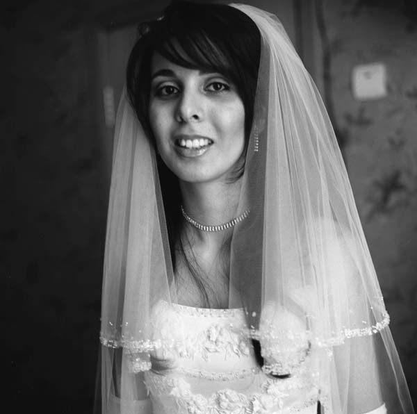
Well placed valued on the negative. It appears there may be more texture in the black hair than comes through in the scan and upload.
The high tones are nicely placed allowing very attractive gradations across the upper scale.
To my eye, it appears to be a bit tightly composed above the bride's head. I would prefer to see a little space there. I would also do a slight graduated burn on the right side. It would help balance the print and reduce, slightly, the distraction of the white rectangle.
Over all the image works nicely and you hit the curve well with the exposure. Nice photo.
Photrio.com contains affiliate links to products. We may receive a commission for purchases made through these links. To read our full affiliate disclosure statement please click Here.
PHOTRIO PARTNERS EQUALLY FUNDING OUR COMMUNITY:
This site uses cookies to help personalise content, tailor your experience and to keep you logged in if you register.
By continuing to use this site, you are consenting to our use of cookies.